
ARIA

Improving transparency in flight booking, just as fast
OVERVIEW
PROBLEM
With an average of over 100,000 commercial flights each day (OAG) booking flights is now a common task.
The process may be familiar… but is it actually enjoyable?
Users must weigh multiple factors when booking: times, trip purpose, number of passengers and, of course, the price (while keeping an eye out for hidden fees). On mobile, the limited screen space makes this even harder, with over half of survey participants reporting they prefer booking flights on a laptop. Finally, the long sequence of add-ons at the end of the booking flow often adds frustration to the user’s experience.
ROLE:
UX Designer
TYPE OF PROJECT:
Academic
CONSTRAINTS:
Improve the booking flow for one use case only
No research, marketing or customer satisfaction data provided
TOOLS:
Google Forms
FigJam
Figma
DURATION:
6 months
Research
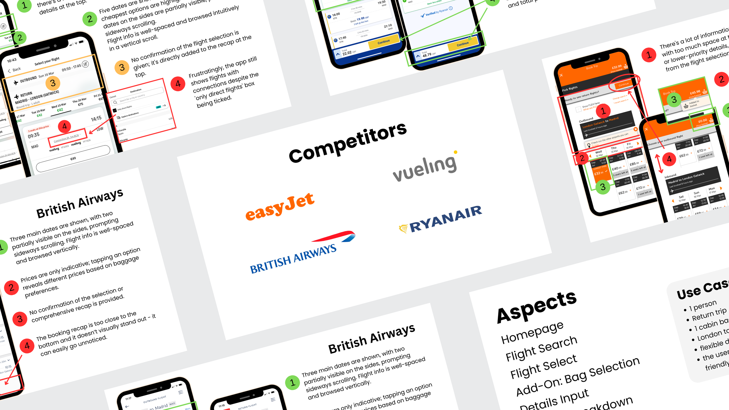
COMPETITIVE BENCHMARKING
ONLINE SURVEY
USABILITY TESTING
COMPETITIVE BENCHMARKING
What are users familiar with?
My first step was to conduct a competitive benchmark of four airlines using heuristics evaluation. My objective was to identify:
best practices worth adopting
conventions established by competitors
pain points to improve and turned into advantages
Here is what I learnt:
😊 POSITIVE CONVENTIONS
Straight-to-Action Homepage: a search box from the start saves the step of tapping a ‘Book a flight’ button
Step-by-step Flow: breaking down a return flight into two separate selections for the Outbound and Inbound flight
Thumb-Friendly Layout: big, chunky buttons and input fields at the centre or bottom part of the screen were preferable
Icons and lists facilitating quick scanning when checking details
Date selection on calendar in one screen (for both Outbound and Inbound flights) in a vertical chronological order
Recap accessible at the bottom of the screen and selection confirmation
Flight selection layout (dates horizontally and flight times vertically scrolling)
😡 FRICTION POINTS
Lack of reassurance: not allowing users to check selections
Lack of transparency: not allowing users to check total price during the booking process
Confusing wording and long small print without icons discourage scanning, especially during add-on selection
Positioning ‘next step’ buttons too high and/or small on the screen slows down the flow
Redundant selection slows down users: selecting add-ons after each flight (in return trips) unnecessarily slows down the booking process
Excessive amount of upselling screens after flight selection
ONLINE SURVEY
To understand booking habits, app usage, and pain points, I ran a survey with 31 participants.
64.5% have used an app to browse or book flights 📱
📱 Main reasons of preference
Ease, convenience and on-the-go booking.
😄 Positive experience (71%)
Described as easy, simple and quick.
⚠️ Frustration (29%)
Nearly 1 in 3 described the booking process as frustrating, even when they completed it successfully.
💡 Suggestions (22.5% had none)
Most participants wanted clearer baggage information and fewer upselling steps.
USABILITY TESTING
I moderated one usability test (EasyJet and Ryanair) and acted as a note-taker for two others, conducted and provided by the UXDI (AerLingus and Eurowings).
From these, three key findings emerged:
😕 Overwhelming flow
Selecting outbound and inbound flights on the same page confused users.
They preferred splitting the task across two clearly labeled screens.
🧐 Fare comparison
Icons and list views helped users compare fares quickly, making higher-priced options more appealing.
😡 Add-ons frustration
Excessive extras and small, hard-to-reach buttons created friction and reduced satisfaction.
Define
AFFINITY DIAGRAM
CUSTOMER JOURNEY MAP
AFFINITY DIAGRAM
Finding patterns
I chose to run this activity in person to foster communication and exchange of ideas.
I collaborated with four other people from different professional backgrounds to bring diverse perspectives and improve the quality of insights.
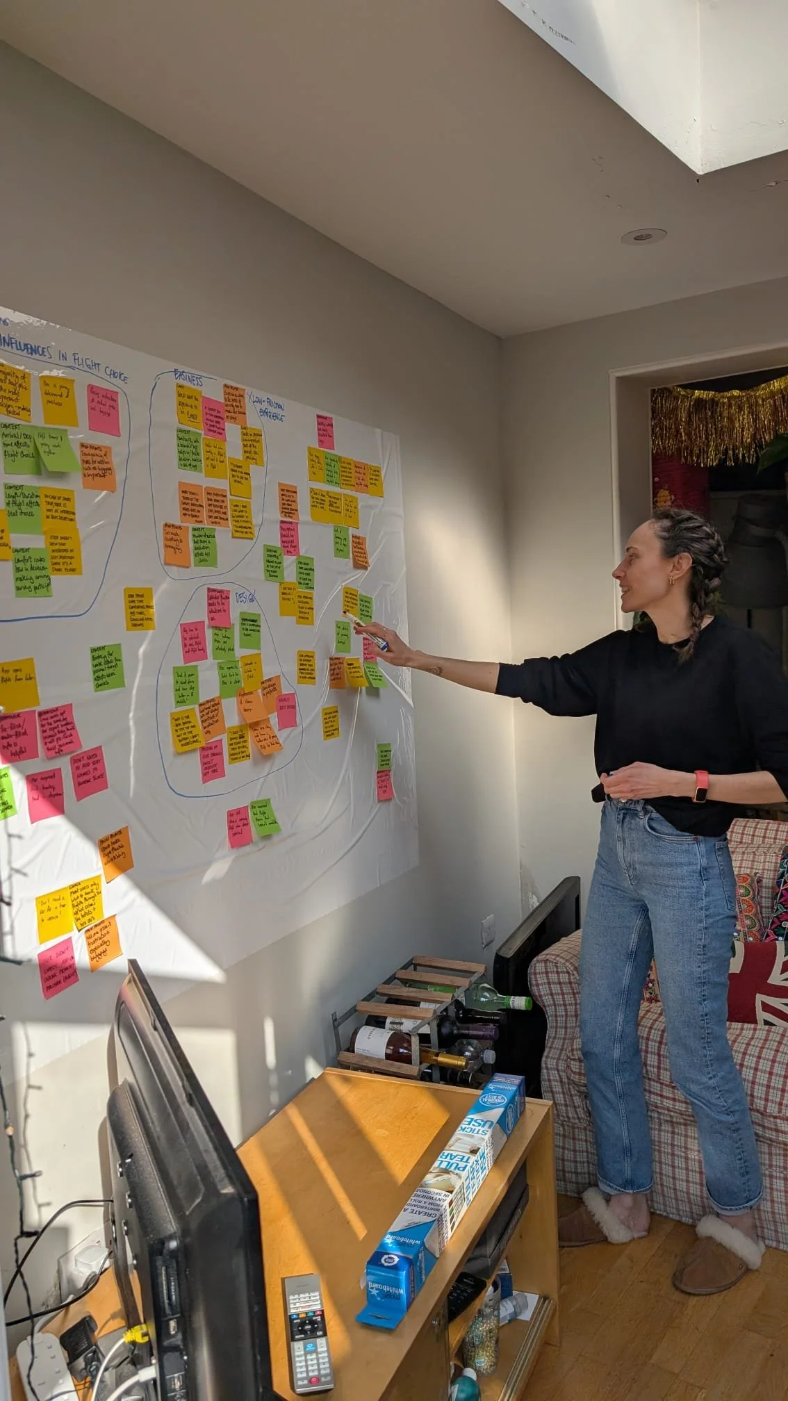
What mainly emerged is that:
🏃 Users appreciate a quick and easy booking experience
🔍 Value transparency and ongoing reassurance about total price and selections
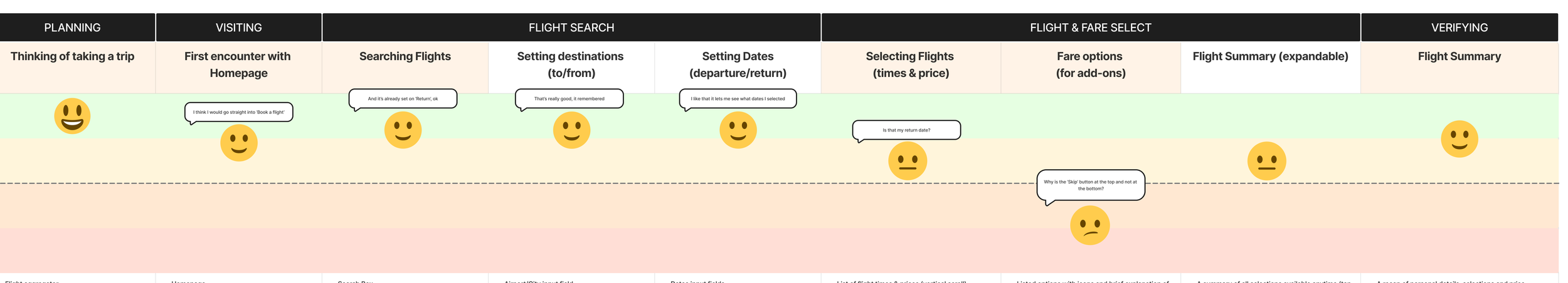
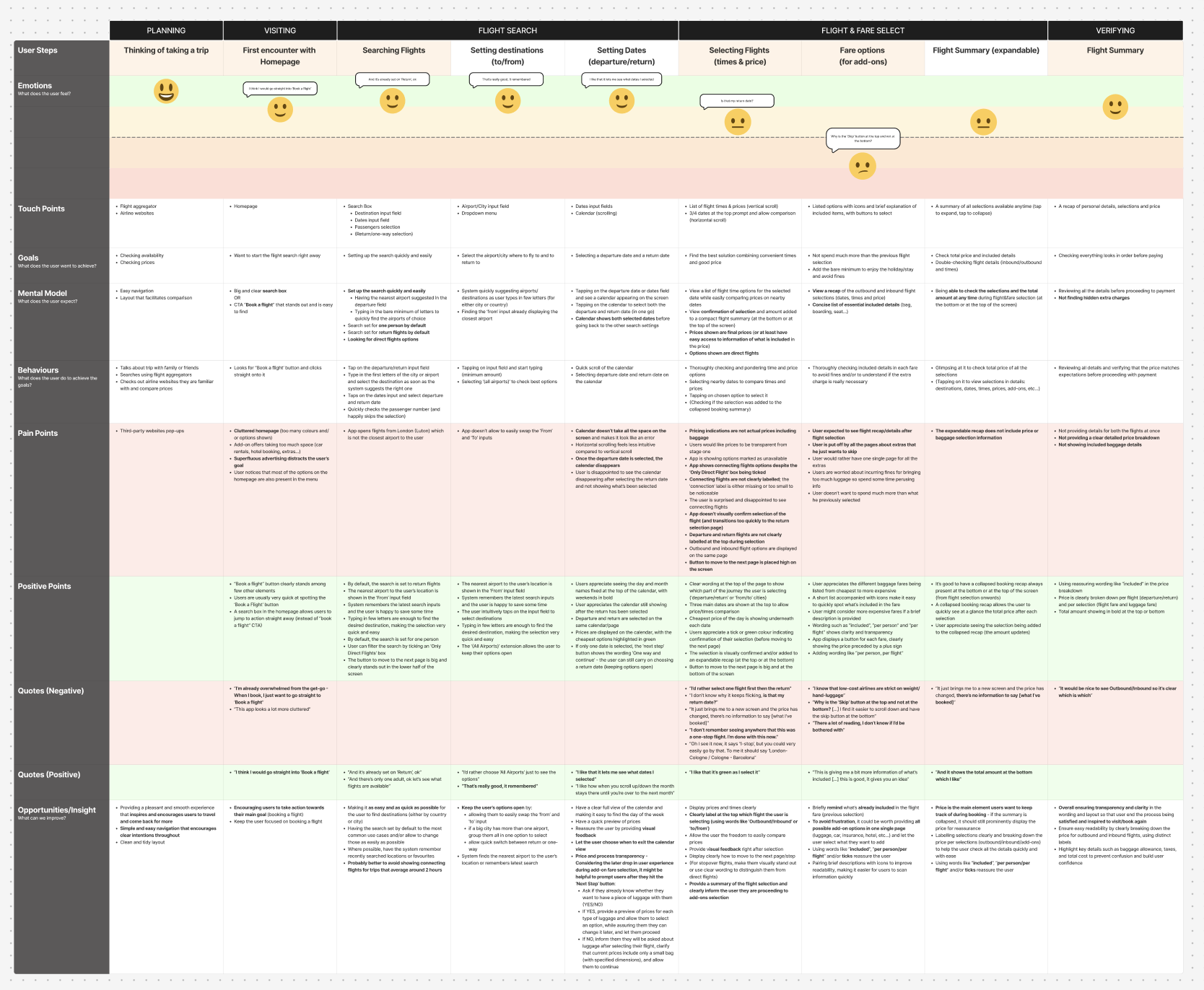
CUSTOMER JOURNEY MAP
To pin point friction and leverage opportunities for competitive advantage, I translated my research into a Customer Journey Map.
I mapped a typical booking scenario across five macro stages to visualise the end-to-end user experience:
Planning
Visiting
Flight Search
Flight & Fare Selection
Verifying
A clear dip during the add-ons stage was revealed, mainly due to:
🎒 Unclear baggage options
🙇🏻♀️ An overload of extra-service screens
My main question at this point was:
how might we improve transparency while keeping the booking experience quick and simple?
Option 1: 🔍 Prioritise Transparency
My initial idea was to ask users right after their flight search whether they planned to bring cabin or hold luggage.
PROS: This could allow users to see the full price (flight + luggage) upfront
CONS: It could slow down one of the most common user goals from my survey - quickly checking prices (61.3%). It might also complicate the price-tracking and purchase sequence unnecessarily.
Additionally, I considered the business perspective: airlines likely profit from luggage bundles, and these bundles are also a quick, simple way for users to add bags. Removing this step was not realistic.
Option 2: 🏃 Prioritise speed and simplicity
Competitive analysis showed that most airline apps present flight selection first and add-ons afterwards.
I decided to keep this familiar flow convention but introduce elements that improve price transparency throughout the flow, ensuring users feel informed without slowing them down.
Ideate
FLOW DIAGRAM
SKETCHES
MY SOLUTION 💡
Design an app that allows users to book flights quickly and easily while staying aware of total price and progress at every step.
My design goal was a clean, simple, distraction-free interface that feels both easy and enjoyable to use.
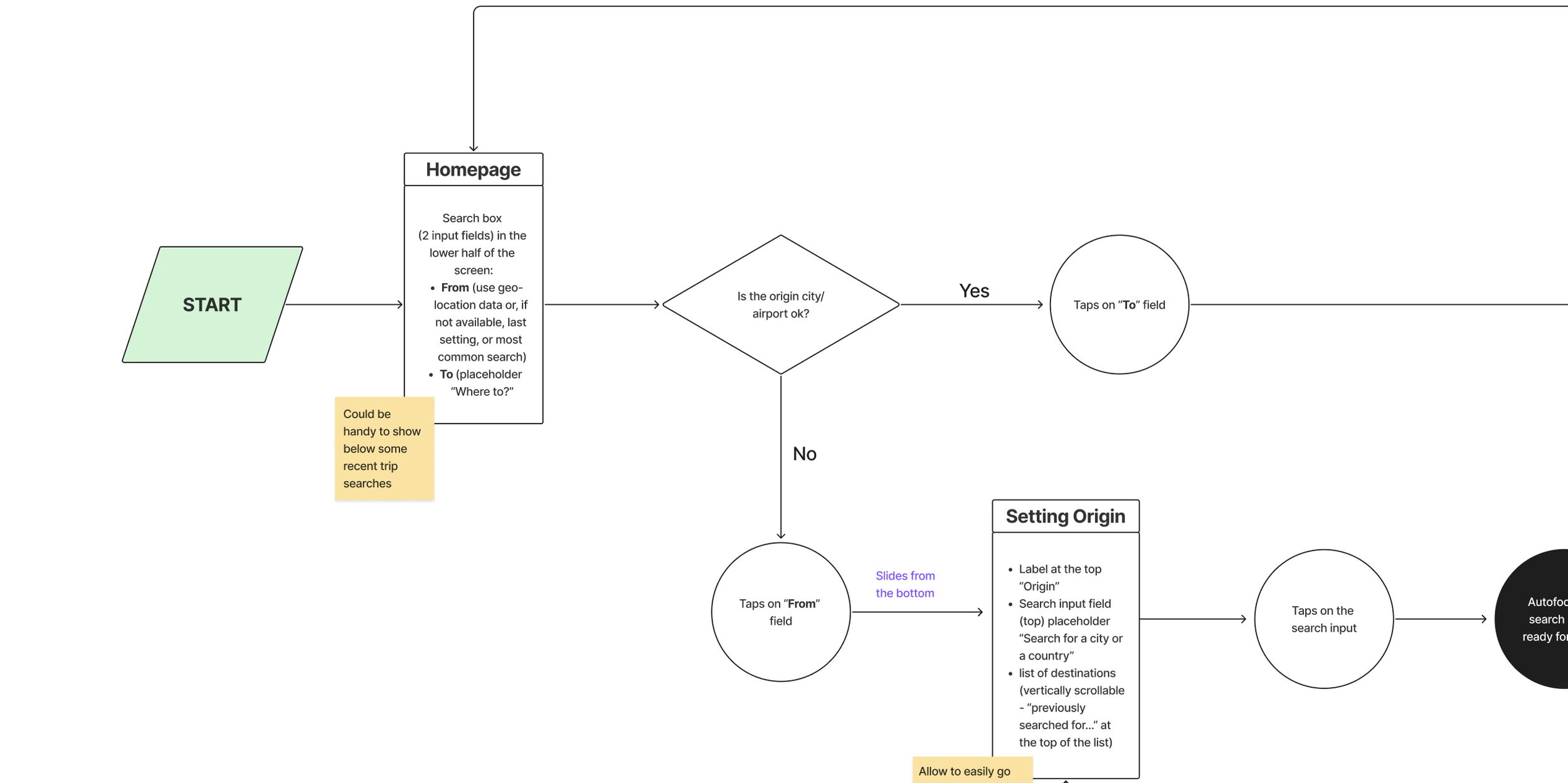
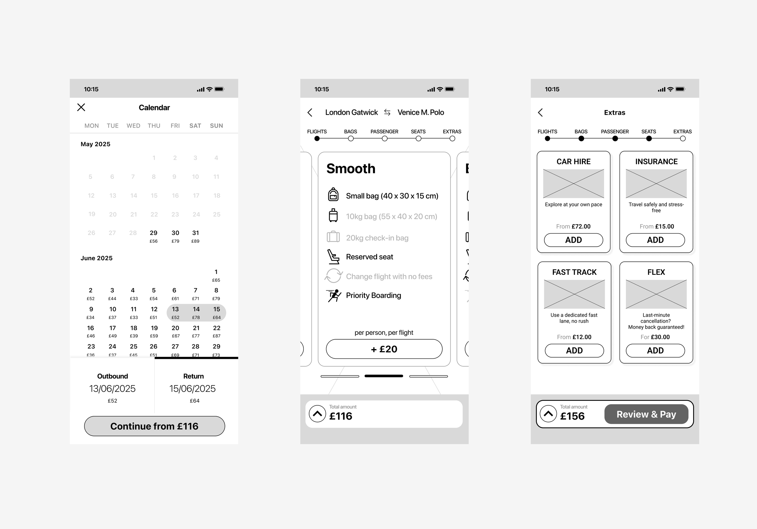
FLOW DIAGRAM
To map the experience and optimise my design process, I created a flow diagram to understand how many screens were needed for the scenario of a single passenger booking a return flight on the go with one cabin bag (no forced login).
Since my priority was speed and simplicity:
I kept the familiar sequence of:
Flight → Add-ons → Seat selectionTo reduce friction, I grouped all extra service offers into a single screen just before checkout
INTERACTION SKETCHES
When sketching, I took inspiration from existing apps to create a smooth, familiar experience while adding new elements that reinforced transparency:
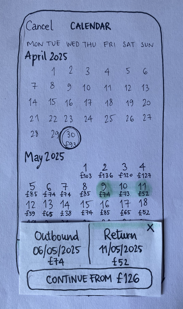
Next-step wording: The button shows “Continue from £xxx” after date selection, gently hinting that the displayed amount is not final.
Progress tracker: Visible from bundle selection through to payment, helping users understand where they are in the process.
Facilitated comparison: Each bundle displays all details, but only the included ones stand out in bold. A “+” before the price indicates the amount will be added to the total in the recap at the bottom.
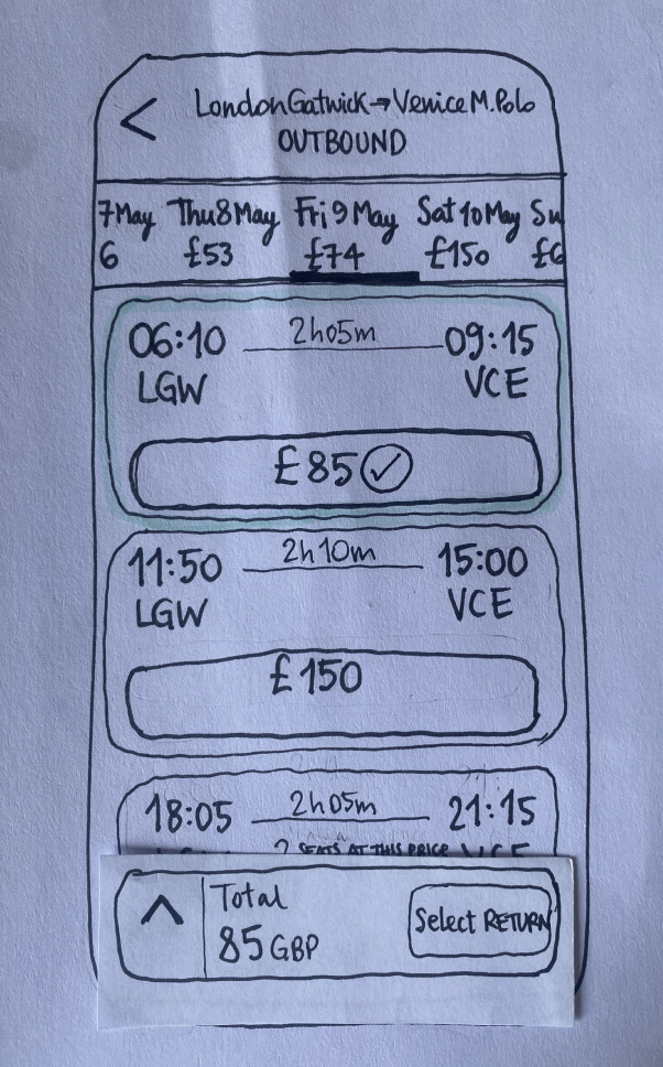
Recap: A collapsed booking summary stays visible at the bottom of the screen throughout the flow.
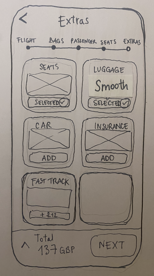
All-in-one extras: Grouping together all the extras in one screen and labelling it ‘Customise’ to give this step a more positive feel - not upselling, but a benefit for the user.
Prototype
WIREFRAMES
MID-FIDELITY
HIGH-FIDELITY
WIREFRAMES & MEDIUM-FIDELITY
Validating usability before investing in branding
I transferred my sketches into Figma to build the app’s basic structure.
These wireframes acted as a draft for testing layout, flow and overall usability before moving into visual design.
I later added screen states and interactions so users could move smoothly through the booking flow.
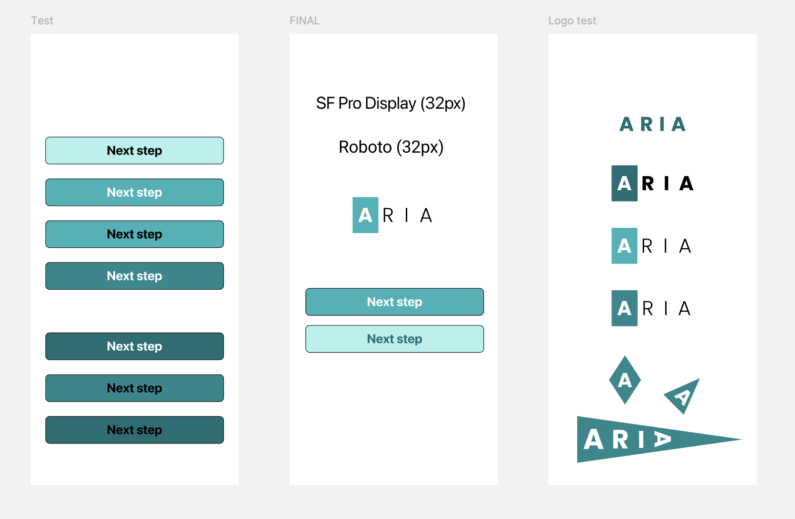
Since this was an academic project, branding was kept light but intentional to support the high-fidelity prototype and maintain colour consistency.
Name: Inspired by the Italian expression “liberi come l’aria” (free as air), I chose the word ARIA to evoke lightness, freedom and adventure.
Dominant colour: A calming blue-green to remind users of both sky and water, inspiring a sense of peace while building excitement for the destination.
Typography: To maintain a minimal, distraction-free look, I used clean system fonts (SF Pro Display and Roboto). Keeping typography simple also reinforced the company’s professionalism and trustworthiness.
BRANDING
Enhancing the experience
Images: Full screen images were used to provide breathing space, convey freedom and inspire users to travel.
Bundles: Each bundle was given a distinct accent colour to add a playful touch and help users quickly spot their selection (even in the collapsed recap).
Simple recap: Detailed information in the expanded recap was kept in black and white to help users quickly scan their selections and distinguish them from the main booking flow.
HIGH-FIDELITY
Validate
USABILITY TESTING
USABILITY TESTING
✅ All 5 users completed the booking successfully.
‘Smooth’ and ‘straightforward’ were their most-used words to describe the experience.
I moderated 5 usability tests on the mid-fidelity prototype:
Focus: intuitiveness and efficiency of the booking flow
On the third test, I also explored a slightly quicker alternative flow (simply skipping one screen)
The 5th test compared mid-fidelity and high-fidelity prototypes
👍🏻 Most appreciated features
Users loved the detailed expanded recap, the progress tracker and the final screen grouping all extras together.
🎨 Appreciated visuals
Large imagery and distinct bundle colours in the high-fidelity prototype which made selections easy to spot in the recap.
⚠️ Areas to improve
Mixed reactions on the bundle screen - 3 out of 5 disliked the bundles. Some were surprised they couldn’t select bags per flight and the screen made a few feel suspicious or wary, revealing an opportunity to rethink this step.
Reflections
NEXT STEPS / WHAT I LEARNT / WHAT I WOULD DO DIFFERENTLY
FOR THE FUTURE
👣 Next Steps
Although the project focused solely on the booking flow, I included the bundle selection in the final screen (‘Customise’) to allow for potential future enhancements, such as letting users edit their selections or customise luggage per flight.
I would also add a transitional screen during payment processing to reassure users that their transaction is being processed and avoid confusion.
🤓 What I learnt
It’s important to stick to the chosen flow during initial usability tests, rather than making adjustments too early.
What users want is not always what they need.
⬅️ What I would do differently
If I were to redo the project, I would create a flow diagram for a scenario with two passengers sharing one bag to better highlight the luggage customisation issues.